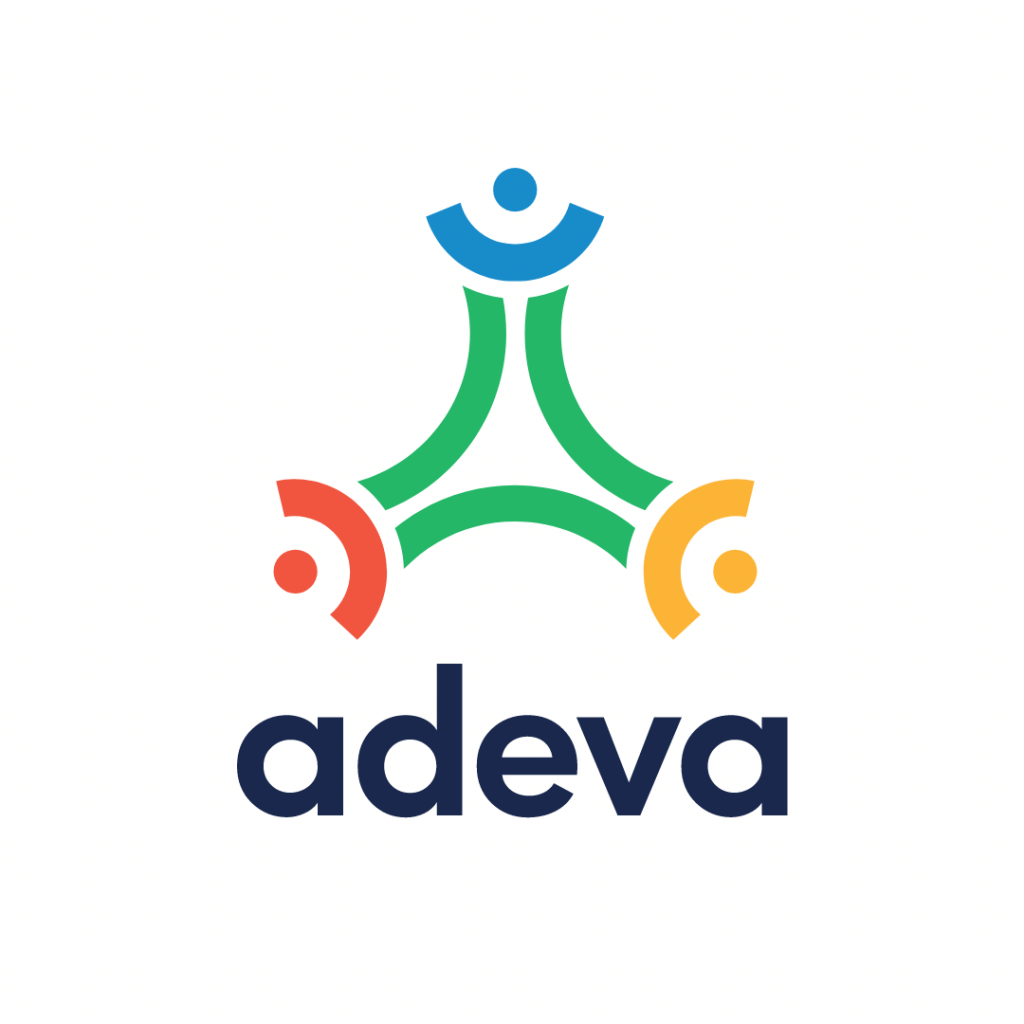
We're excited to share that today, we're launching our new logo. ? We liked the simplicity of our old logo and, as most of you, we're not great fans of change. Yet, Adeva evolved over the years, growing from a local agency to a global network of distributed engineers. We felt our logo should show that growth and everything we stand for.
Adeva's vision is to create equal opportunities for developers everywhere, regardless of their race, religion, or gender. We stand for diversity, inclusion and strongly believe great talent is equally distributed everywhere, not only in the global tech centers. And, that's why a year ago, we decided to transform our local team to a global network of world-class engineers.
In less than a year, we expanded to over 20 countries around the world and we grew as a strong community of people who support each other's growth, have fun, and create friendships across borders. It's time to update our visual identity to show that, too.


Our new logo represents our members working from different parts of the world, yet connected through Adeva's network. The different colors aim to show the diversity we stand for. Coming from different cultures around the world, our team is the main driver of our growth, creativity, and values, and with this, we want to recognize each of them.
Finally, I want to give special thanks to Ognen Trpeski for bringing this to reality, as well as our whole design team for all the effort they put into this. Each of us identified with the result and we are proud to have a visual identity that clearly demonstrates our values and all we stand for.
I also want to thank our whole community and all of our clients for their amazing contribution to what Adeva is today. We wouldn't be here without you.
Looking forward to all of the amazing things we're about to create in the future. Together.


