
Data visualization: the art of communicating information through visuals.
Businesses today should rely on the biggest amount of data available to make the smartest and most well-informed business decisions. How do customers move through my digital store? What's the performance of my sales team?
These complex systems are hard to understand, much less fix, if you are not able to have a clear picture of the processes underneath.
Thanks to data visualization, making information understandable and actionable can now be an easy and affordable task for everyone.
However, there's a catch!
Putting complex numbers and other pieces of information into graphs is not enough. Anyone working with data needs to follow data visualization best practices to present that data in a way that's easier and understandable for the audience.
In a nutshell, data visualization should be easy to understand, on-point, appealing, and never misleading.
Exploratory and Explanatory Analysis
One of the first things one should consider when preparing a presentation using data visualizations is to understand the purpose.
What is the primary goal of the data visualization?
There are two basic types of data visualization: exploratory and explanatory.
The purpose of exploratory analysis is to allow users to explore the data and look for patterns and trends without setting a specific prior end goal.
An explanatory analysis, on the other side, is the kind of data visualization that we create when we have an end goal in mind. There's something specific we want to convey to our audience.
In this article, I'll focus on the explanatory type of analysis and share best practices for creating this kind of data visualizations.
Understanding the Context
Before rushing ahead to start creating the data visualizations, it's important to take a step back and understand the context.
You should be able to answer the following questions:
- Who? Who is our audience? Are they high-level people; is the audience biased or not; do they have all the background information needed, etc;
- What? What is the point your audience needs to understand, what are the points we want them to look at so they can take action afterward, etc;
- How? How can I pass the intended message as clearly as possible to my audience?
Choosing an Effective Visual
Once we have a clear idea of what we want to transmit and know the audience well, it's time to choose the most effective visual.
Simple Text
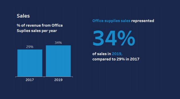
When there are only a few numbers to convey, simple text can be a great way to emphasize the message.
Rather than choosing bars, lines or any other kind of over-complicated visualization that can distract our audience from the main purpose, opting for simple text-only gives more emphasis to the specific numbers and messages we want to transmit.
Tip: When opting for simple text, think about whether you should highlight the main number, make it bigger or smaller, and how much size and/or color difference should it have in relation to the surrounding words and numbers so that it is as easy as possible to interpret its value and importance.
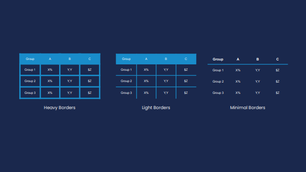
Table
Tables are a great visualization tool to succinctly communicate multiple messages to a mixed audience with different goals. The emphasis should be put on the data and not on the design. As the table is quite heavy by itself, you want to take the attention away from the table and lure your audience's attention to the data.
Tip: Consider going with a more minimal design in order not to distract your audience.
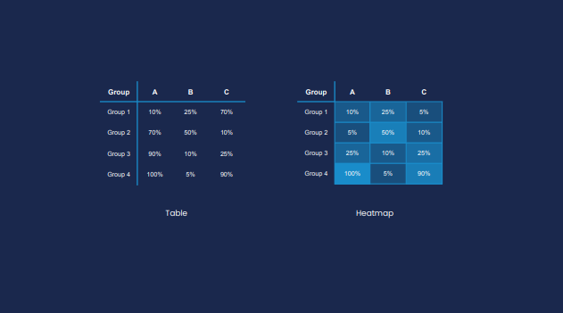
Heatmaps
Heatmaps are a powerful alternative to tables. They're a great tool if we want our audience to compare or understand the differences in values quickly.
Tip: Create a heatmap using a color scheme with just one color and different saturation levels for each order of magnitude. Alternatively, you can opt by using multiple colors, which will bring more attention to the differences in the numbers' magnitude.
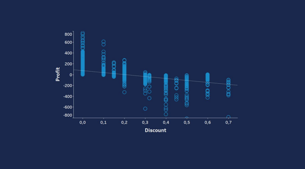
Scatterplot
Scatterplots are a great way to show the relationship between two variables. Using this type of tool, you can easily show the relationship between two variables, if they're proportional, not proportional, semi-proportional, or if there's no obvious correlation between the two.
Tip: If there are more than two variables, you can use color to show the relationship to the third dimension, but if there are more than three variables, a scatterplot isn't the best option.
Line Graph
Line graphs are quite common as they're one of the best ways to show change over time. They make it easy to see whether your measures are going up or down and can be incredibly powerful if you have more than one category to compare over time.
However, try not to add too many categories at once to avoid the "spaghetti" effect, where categories become hard to distinguish.
Tip: Avoid using too many different colors at once, but instead look for the category you wish to highlight and choose a different color for that one only.
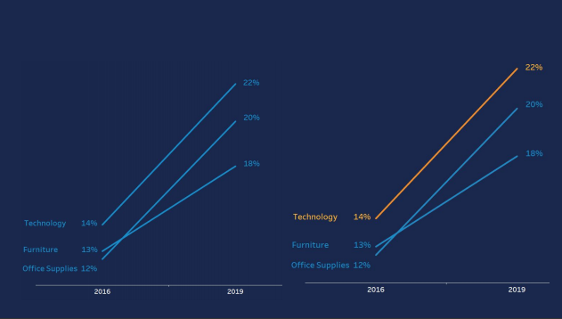
Slope Graph
Slope graphs are best used to show the relative variation of multiple categories across two time periods or points of comparison. They make it easy for your audience to see the relative increase or decrease of a category over a period of time. The same "spaghetti" effect can appear in a slope graph, so avoid adding too many categories of colors in one graph.
Tip: Highlight the category you want your audience to pay attention to the most.
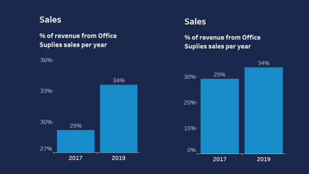
Bar Chart
Bar charts are among the most common and popular types of charts, making it one of the easiest ways for an audience to compare categories. Often, people are tempted to use more complicated visuals to make data look fancier and more elaborate, but sometimes, and almost always, the simpler option is the better option. The greatest thing about bar charts is that they convey data straightforwardly, making it easy for your audience to understand what you're trying to convey without wasting mental effort to make sense of the graph itself.
Tip: The chart should always have a zero baseline to allow an accurate comparison.
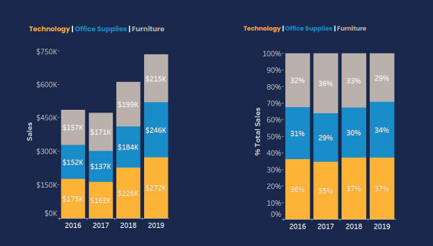
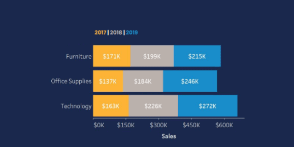
Stacked Vertical Bars
Stacked vertical bars allow the comparison between totals across categories and to see each sub-component's contribution to the total. You can structure them as absolute numbers or with columns summing to 100%.
Tip: Pay attention to the order of categories. A good practice is to always put the category you want to highlight right after the zero axis, so it's easier to compare with other categories.
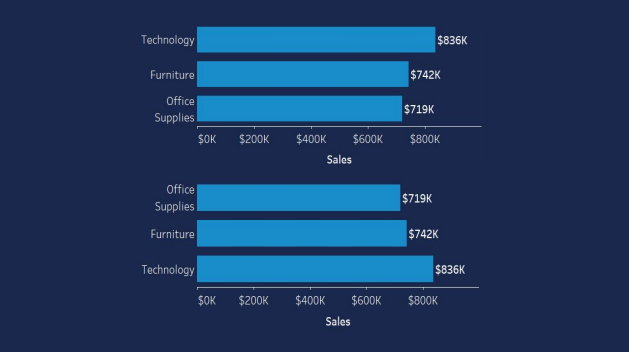
Horizontal Bars
Horizontal bars are the best visuals for comparing categorical data. One thing to take in mind is that the data is processed in "z" shapes, meaning, the first place people look when looking at this type of graph will be the top left.
Tip: Place the most relevant category at the top to make it more visible to your audience.
Stacked Horizontal Bars
Stacked horizontal bars are best used to show the totals across different categories, giving a sense of the subcomponents. Help readers visualize the key part of your large data set more easily by placing it on the top since it will be the first place to be screened as users look at your visual.
Tip: Equivalent subsections should be in the same color in each bar, so that they can be easily compared across categories.
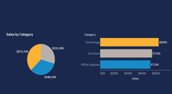
⚠️ Avoid Pie Charts ⚠️
Pie charts make it difficult to understand each category's magnitude, especially when there are several categories or limited variation.
The one time a pie chart can be helpful is if we only have one category and want to show the percentage out of the total.

How to Make Your Visuals Simpler, Lighter, and On-Point
There's a quote by Antoine de Saint-Exupéry that goes:
Perfection is achieved, not when there is nothing more to add, but when there is nothing left to take away.
When preparing a data visualization, the designer or the client may be put off by the large white spaces on the presentation and feel tempted to fill in the blanks with more visualizations.
However, the more things you add, the more difficult it will be for your users to process the information and find the key insights you are trying to convey.
As a rule of thumb, a good tip is to remove everything that doesn't add value.
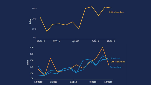
For example, let's take a look at the chart below and try to simplify it:
Step-by Step Tips
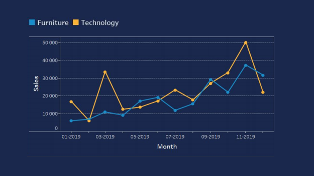
- The first tip for making the graph easier to understand is to remove the borders to make it less cluttered.
- The second tip is to remove the gridlines. This can be a matter of taste, depending on the client or the data analyst, or on the graph's purpose, but in general, removing the gridlines can make the graph easier to absorb.
- Remove the data markers. If you want to show a trend, in this case, an increase in sales over time, there's no need for data markers. When you have a data marker for every possible point it creates too much information, and it can confuse your users.
- Clean the axis. As we can see from the example, on the x-axis, we have numbers repeating, in this case, the year 2019. On the y-axis, we have all the numbers displayed in a longer form, which doesn't bring any value to your audience. There's a way to make the axes simpler, and that's by converting the numbers into a shorter form (10, 000 --> 10K) and the dates from numerical values into the name of months (01-2019 --> Jan), placing the year only once underneath.
- Also, keep an eye on the colors you add to your graph. In the example, one category is colored in yellow, while the second is in blue. Doing so will make it easier for your audience to compare the two categories.
- Finally, label your data correctly to make it easier for your audience to read and understand the data visualization. In our example, instead of having the categories shown on the top left side, it's better to add them at the end of the graph lines in a matching color to make it easier to compare the data.
Our graph now looks like this:
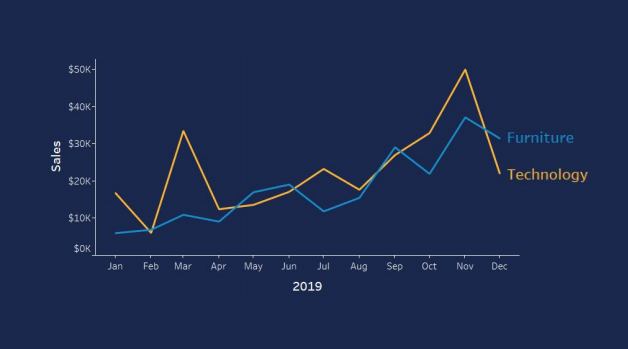
Simpler, lighter, and on-point.
Preattentive Attributes
Preattentive attributes are visual properties that our mind processes effortlessly. According to science, it takes less than 500 milliseconds for the eye and the brain to process a preattentive property of any image.
For data analysts and graphic designers, this means that these preattentive attributes can be used to make it easier for users to understand what is presented through the design. Instead of consciously processing all the data, users can now find valuable insights unconsciously.
You can play with these preattentive attributes to draw attention to which element you want your audience to look at and focus on.
Let's look at the example below:
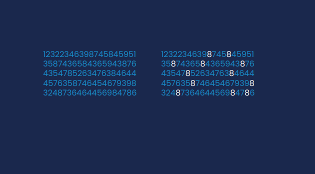
If you look on the left side of the image, and someone asks you: how many eighths are there in the photo? Will you be able to tell?
Now, look on the right side of the photo and imagine someone asks you the same question. It's easier, right?
If you want to make a clear point to your audience, make the job easier for them, rather than make them process all the numbers one by one and expect them to arrive at the same conclusion.
Some of the most effective preattentive attributes that you can use in your data visualizations include:
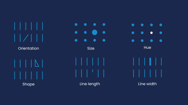
Shapes
With shapes, you can manipulate, for example, an object's size to indicate its importance in a data set, making it larger. In the same way, you can make it smaller and reduce its importance.
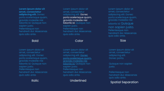
Text
You can do something similar with text, too. For example, you can add text in bold, italic, underlined, in a different color, or use spatial separation to make it stand out. However, be sure not to use all of the techniques at once as you may confuse your audience.
Additional Design Tips
- Colors should be used in moderation, or they will lose their preattentive value.
- Different colors affect humans' emotions differently. For example, red conveys boldness, while purple conveys wisdom.
- A set of colors should be chosen, and each color used consistently for the same purpose.
- Use white space strategically. Having white space in your data visualization is like making a pause while talking. It's a great way to avoid overwhelming users and giving them space to process relevant information.
- Take advantage of contrast. If you use it wisely, it can be super powerful in drawing attention to where you want people to look at.
- Make sure your elements are aligned. Alignment creates clean lines that help establish a sense of cohesion and unity, making the visualization easier to process overall.
Key Takeaways
To start data visualization without knowing the best practices is like packing for a trip without knowing where you're going.
Knowing the climate of the country where you're traveling will help you pick the most suitable clothes. Knowing your audience and your purpose will help you create data charts and graphs that are most useful and understandable.
Should I use a scatterplot or a slope graph? How many colors are too many? Should I remove the gridlines? Do I have to start my y-axis at zero?
Your data visualization efforts will prove far more successful once you educate yourself on the best practices. So set yourself up for success by learning as much as you can about "visual grammar" and offer data visualizations that are both useful and visually appealing.
